P/08 · Back to projects
Oculus — London
Brand & UX
Identity and interface for a fintech searching stock market data with unrivalled precision.
Client
Oculus
Stage
Startup
Based
London
Sector
Fintech
01 — Overview
Branding and UX for a new fintech.
Oculus is a fintech startup with a web-based application that lets users search a broad range of stock market data with unrivalled precision and accuracy.
They needed an identity that carried the same qualities as the technology, and an interface that made the precision usable rather than merely available.
02 — The symbol
An unfurling diaphragm — the focused clarity Oculus brings to complex financial data.
03 — Identity
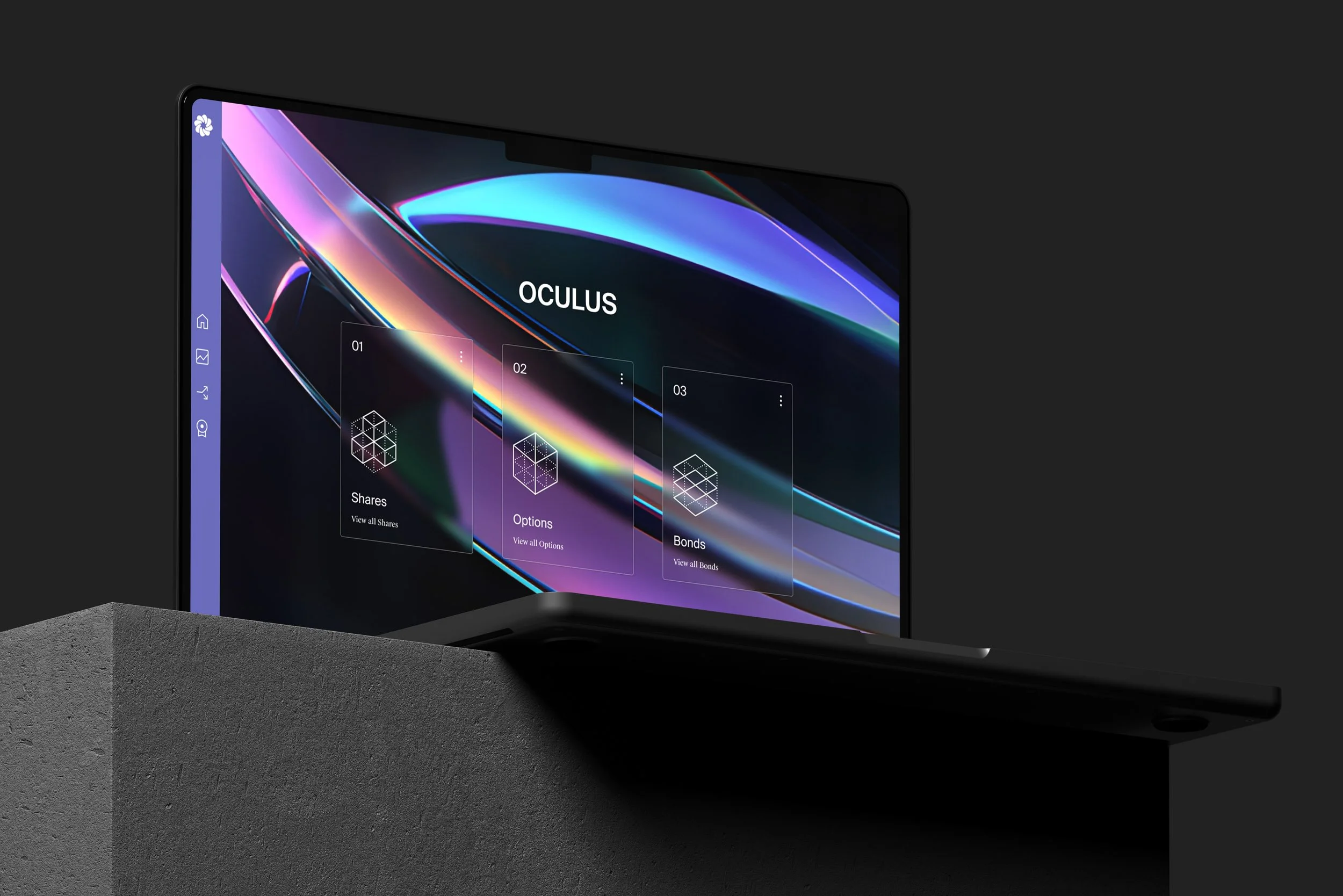
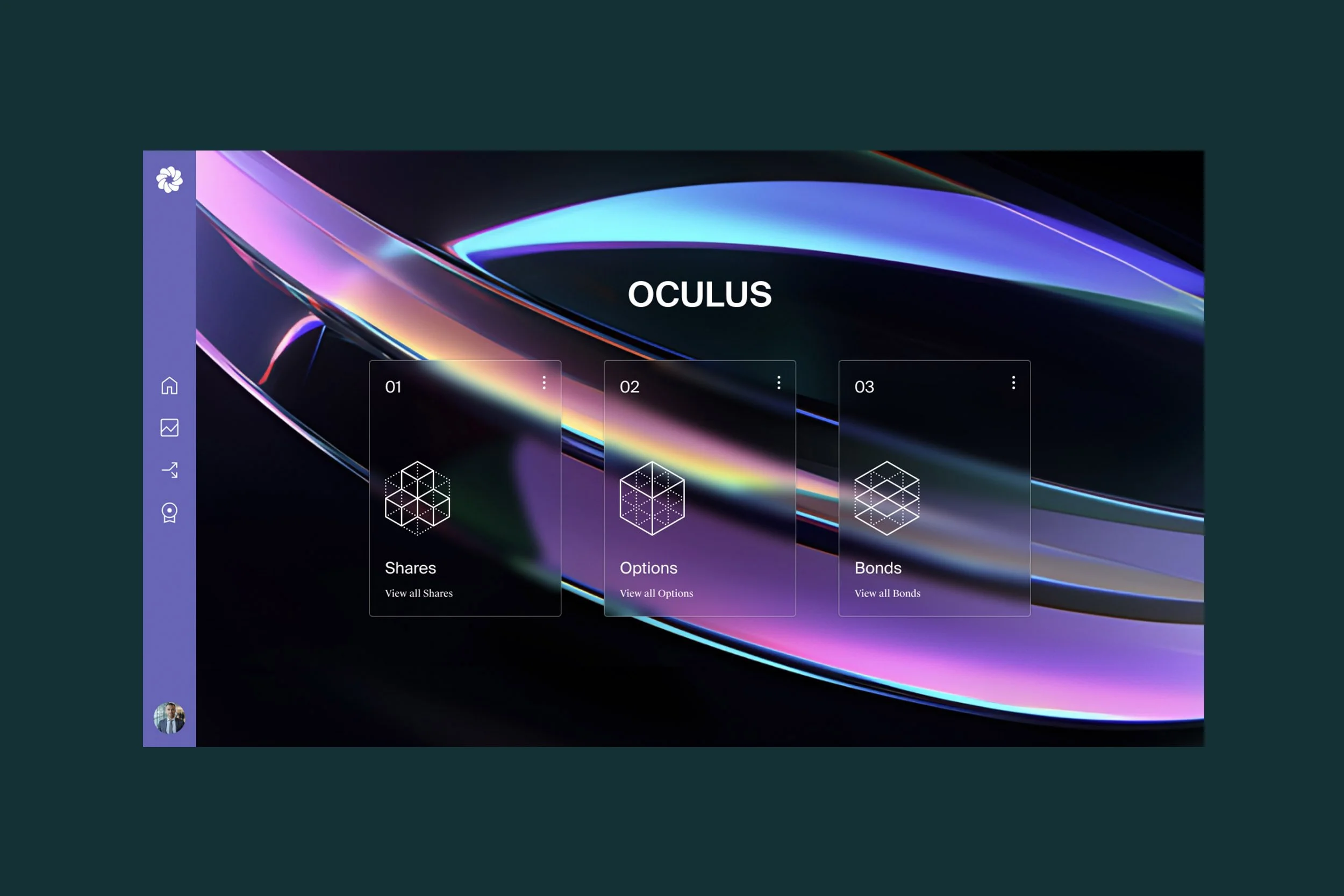
A clean symbol, paired with glass and light.
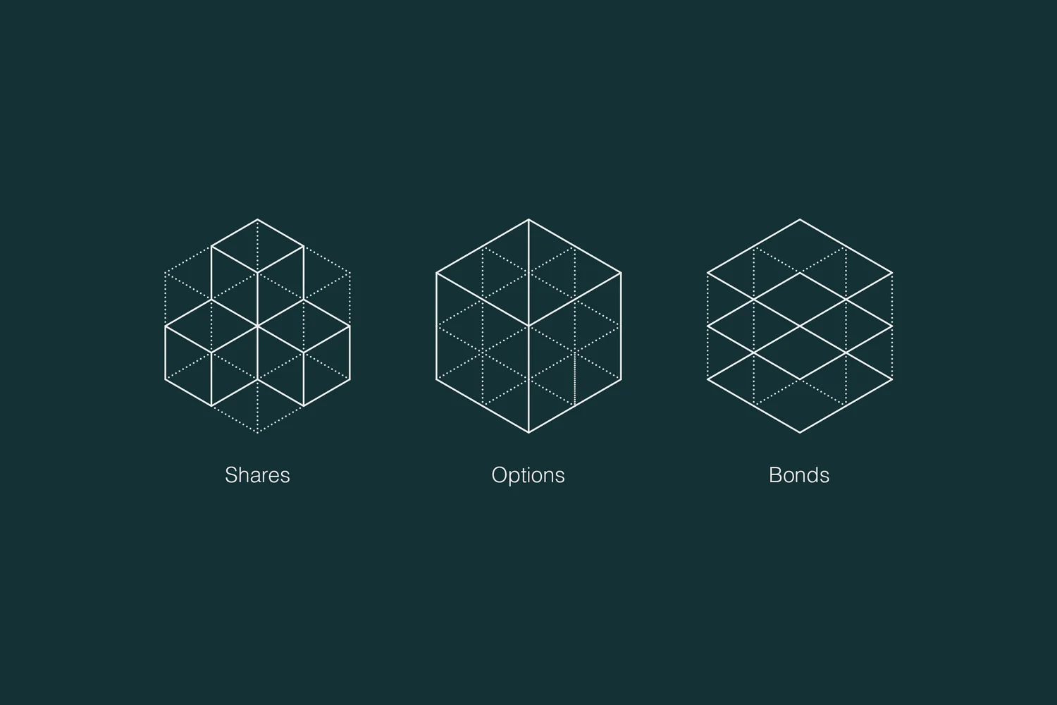
We developed a brand identity that closely mirrors their pioneering technology, centred on a simple, clean graphic symbol of an unfurling diaphragm.
The symbol is paired with striking 3D visuals of glass lenses bathed in vibrant, iridescent light — evoking precision, clarity and technological sophistication, and aligning with the mission to make stock market insight more accessible and actionable.




04 — Interface
Making a large volume of data feel navigable.
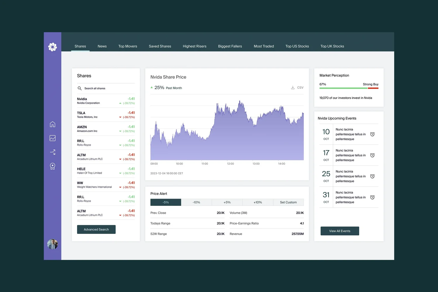
With the identity in place, we developed an interface designed to simplify the analysis of market data.
It was structured specifically to streamline navigation, so users reach key insight quickly without feeling overwhelmed by the volume behind it. Interactive charts, customisable dashboards and clear visual hierarchies present trends and reports in a digestible format — letting people focus on the movements that matter and act on them with confidence.
Interface


Contact