P/07 · Back to projects
Arise — Sweden
Brand Design
A flexible identity for a renewable energy company that had outgrown its own wind turbine.
Client
Arise
Founded
2007
Partner
IDX, Gothenburg
Sector
Renewable energy
01 — Overview
The business changed. The logo hadn't.
Founded in 2007, Arise is one of Sweden's leading independent renewable energy companies, known for a comprehensive 360-degree approach that spans the entire production cycle — from exploration through to long-term management of renewable electricity.
Initially focused on wind power, Arise has more recently expanded into solar energy and energy storage. That expansion left their existing wind turbine logo describing a narrower company than the one that now existed.
Collaborating closely with IDX in Gothenburg on behalf of their client, we were brought in to develop a brand that reflects where the business is actually going.
02 — The idea
A symbol specific enough to mean wind and solar, abstract enough to survive whatever comes next.
03 — The system
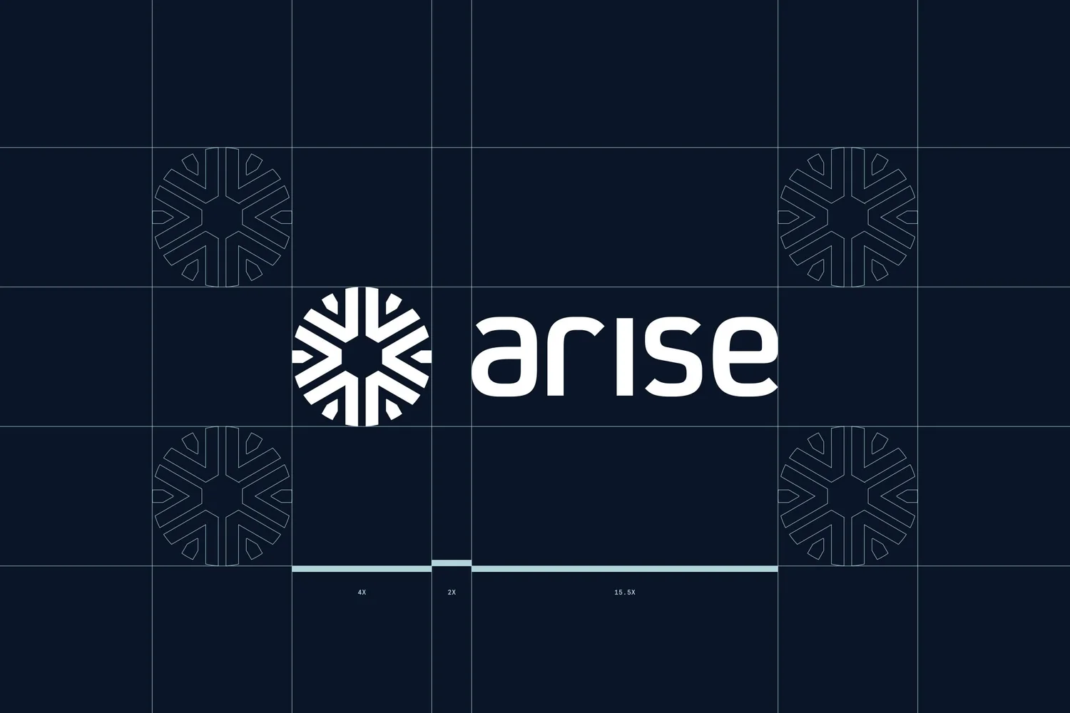
One symbol, and everything geometrically connected to it.
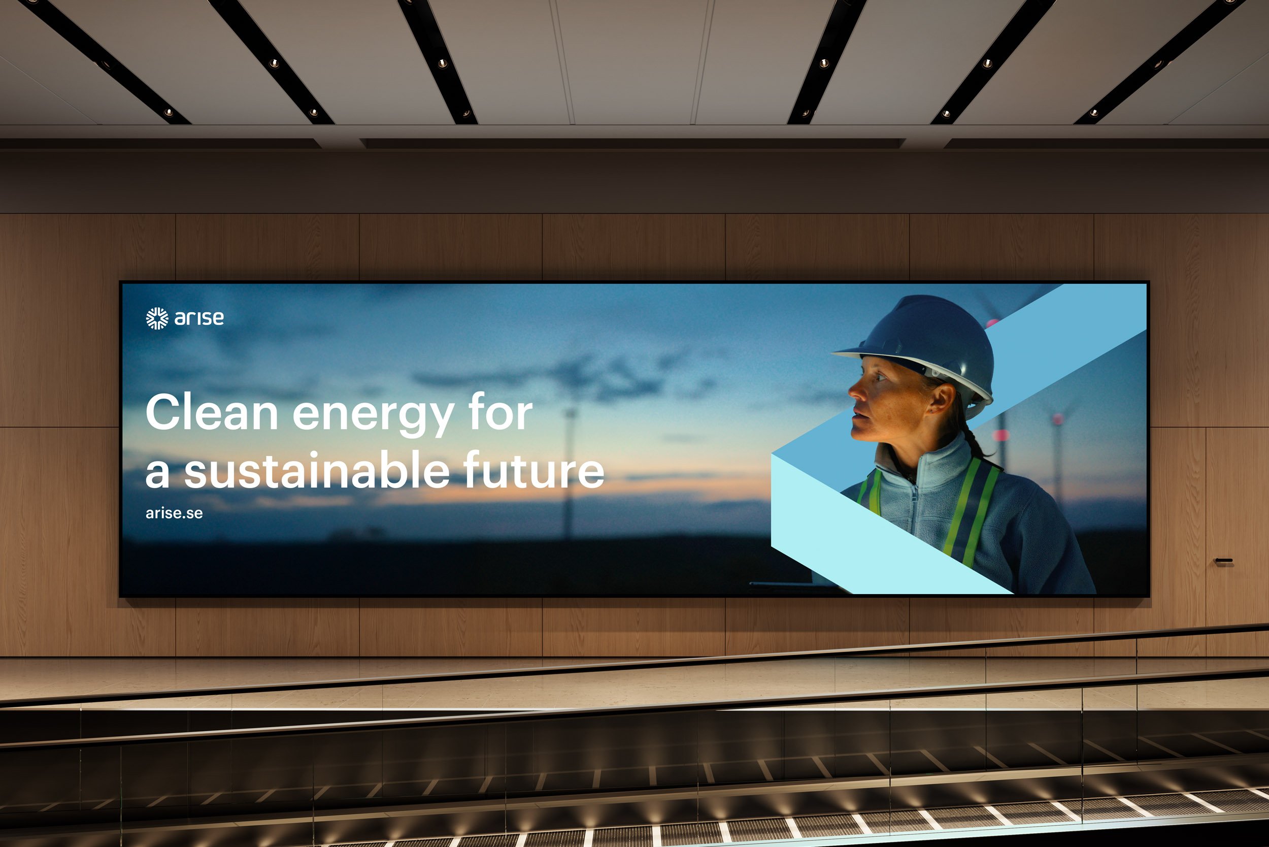
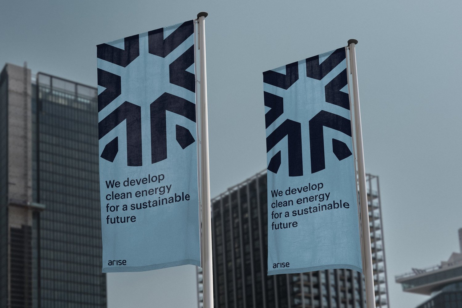
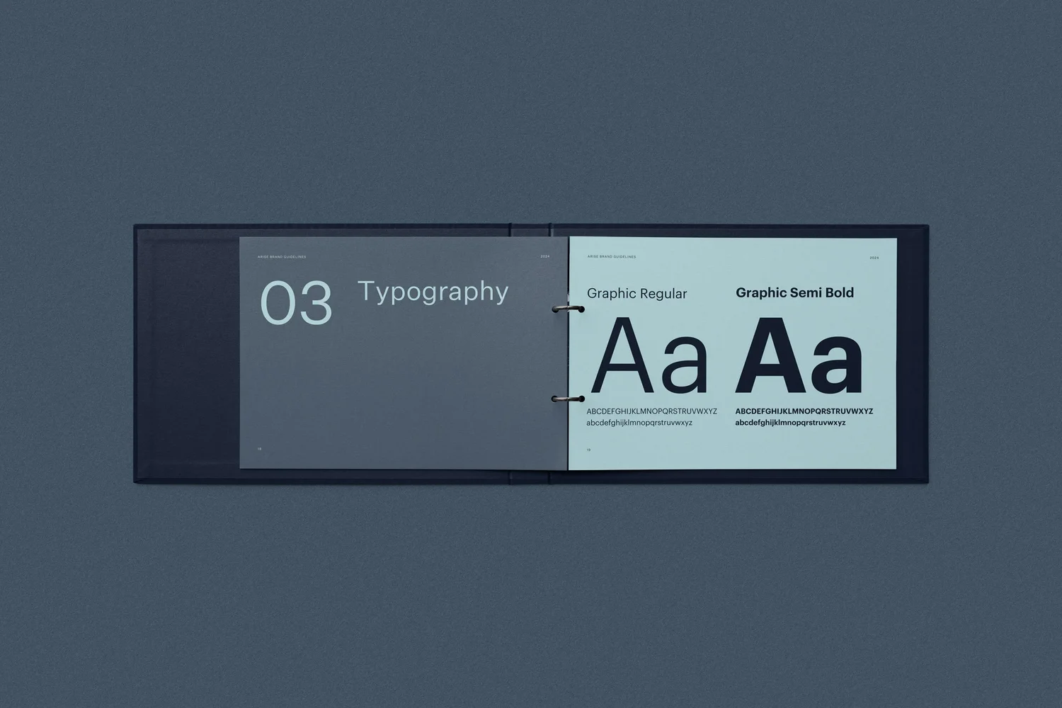
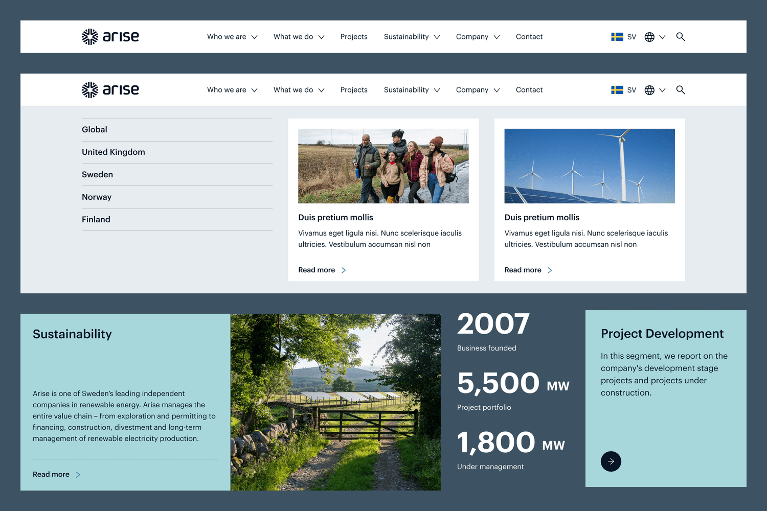
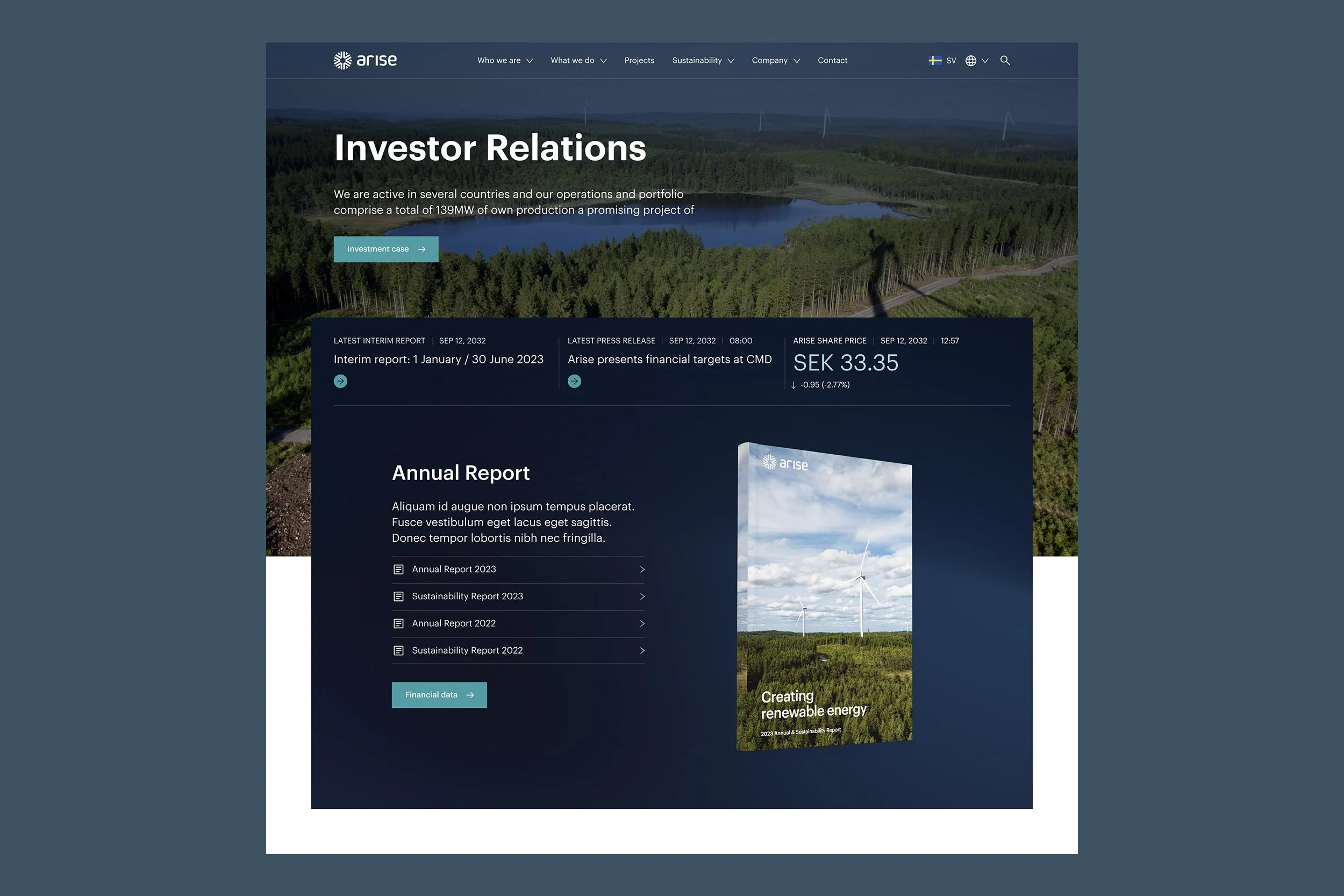
Through discussions with key stakeholders we built a flexible branding system underpinned by a graphic symbol representing the core offerings — wind and solar — while holding an abstract enough form to adapt as the business develops.
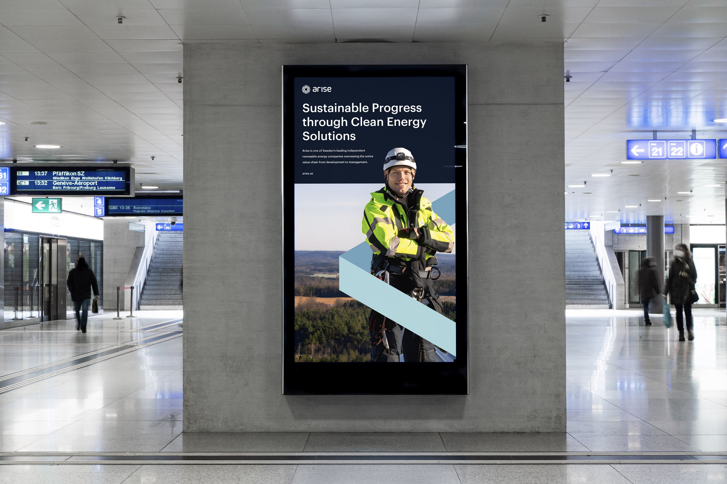
Building on that symbol, we developed a series of identity elements, each geometrically connected back to the core icon. That relationship is what keeps the collection cohesive across every branded marketing material, rather than relying on a rulebook nobody reads.
Delivered


Contact